Leeway
SHORELINE, WAEvergreen for golden hour, Leeway is a new retreat that rises to welcome residents of Shoreline’s light rail district in serene style. Arrive and recline in 1-bedroom, 2-bedroom and studio apartment homes synced to modern luxury with convenient enhancements throughout. With lush nooks and overlooks that dream of warmer places, living in the moment is something transcendent.
OVERVIEWNaming
Messaging + Copywriting
Brand & Identity Development
Brand & Visual Guidelines
SERVICES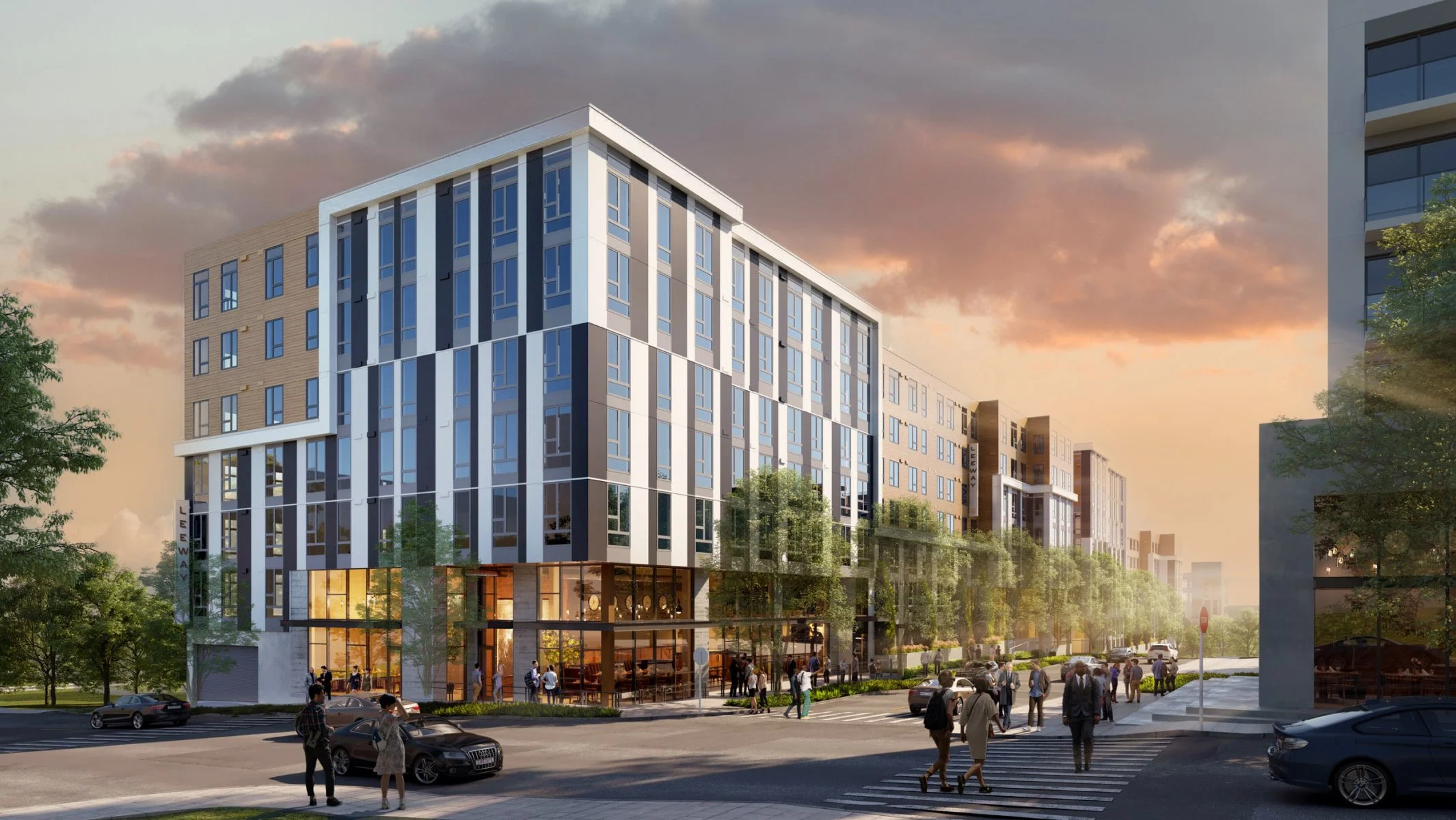

↳ Leeway marked our second project in the Shoreline area, so we aimed to create a brand that could stand on its own while subtly connecting to our previous work.
Conveniently located with easy access to the train for commuters heading to Seattle, the heart of the Leeway project was to design an identity that radiates calm and tranquility. An escape from the busy city life. Drawing inspiration from the serene landscapes of the Pacific Northwest, we shaped a visual identity that offers a peaceful sanctuary for its future residents.
Calm Connection
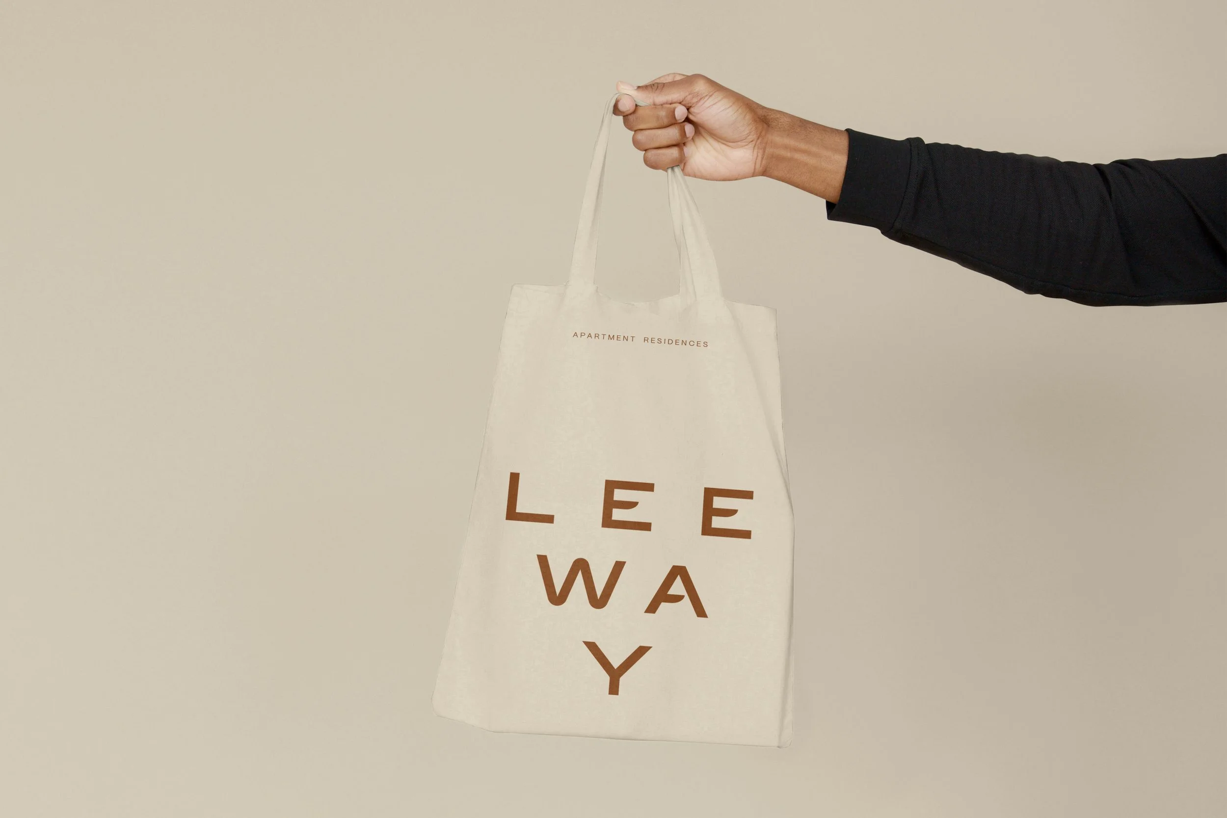
↳ The Leeway logo marks offer both flexability and a firm presence, serving as a reliable brand beacon.
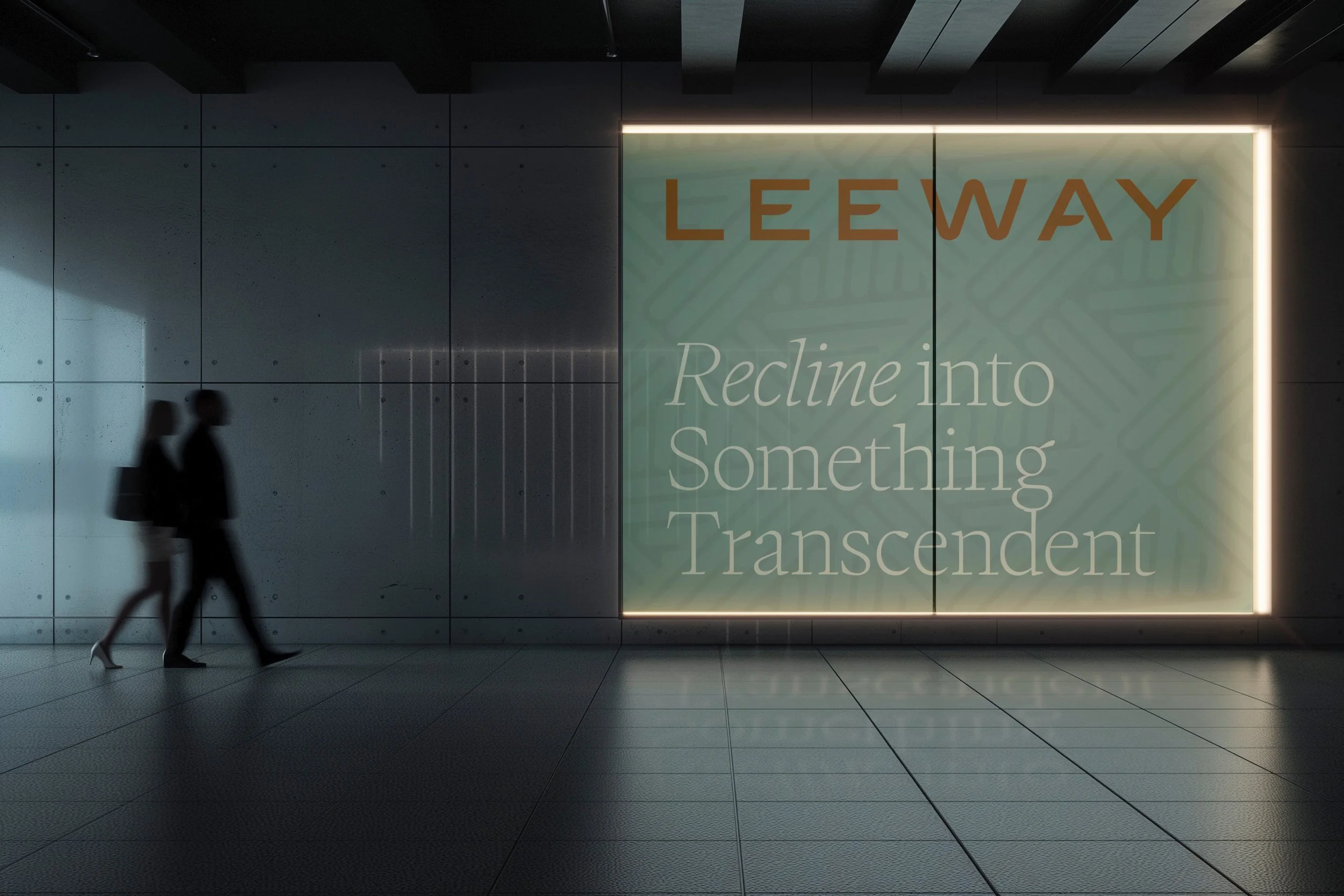
Every element of the Leeway identity has been carefully crafted, from the unique, one-of-a-kind pattern to the custom wordmark. Together, they create a seamless sense of flow and ease that leaves a lasting impression.
Versatile Presence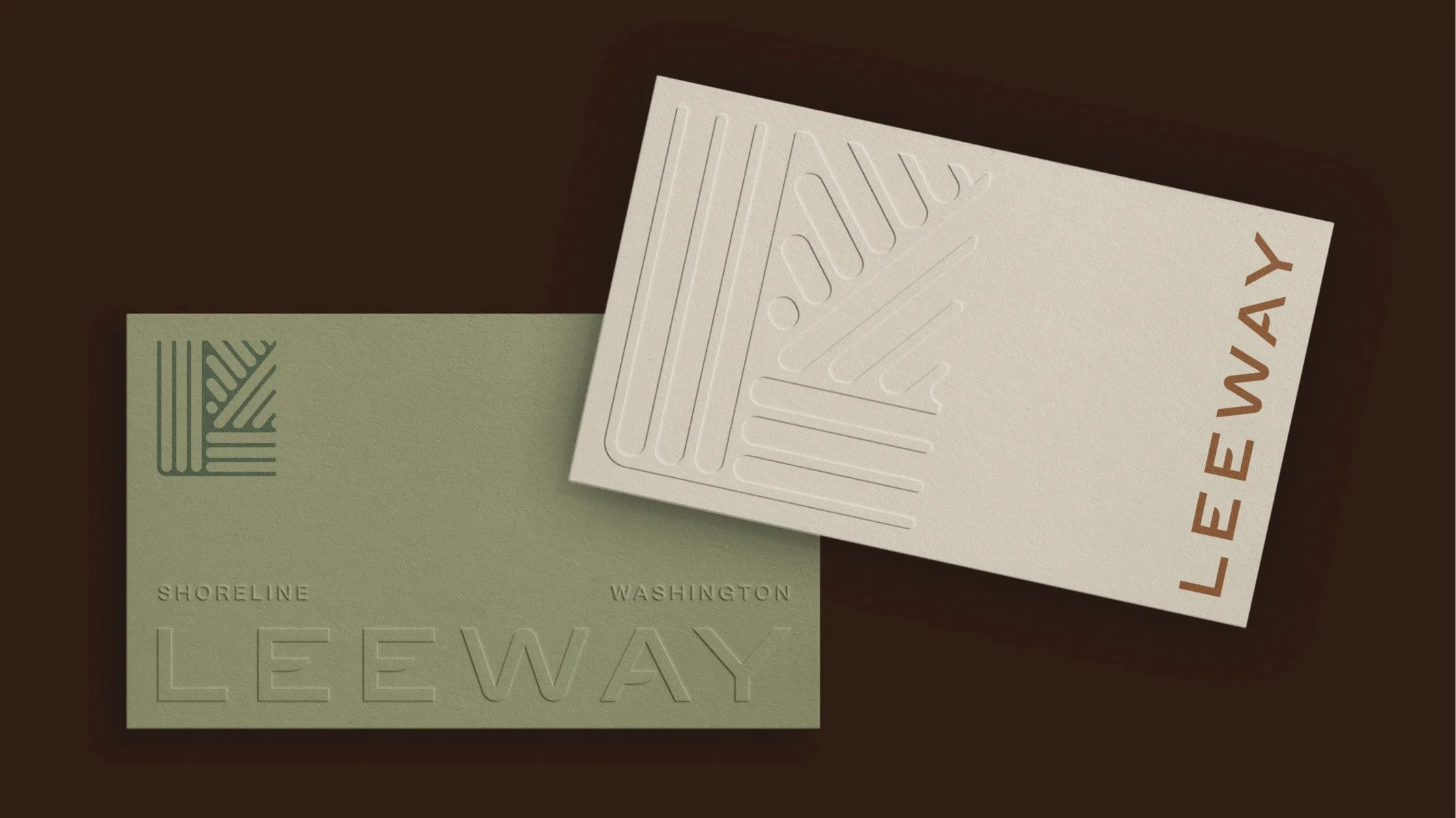
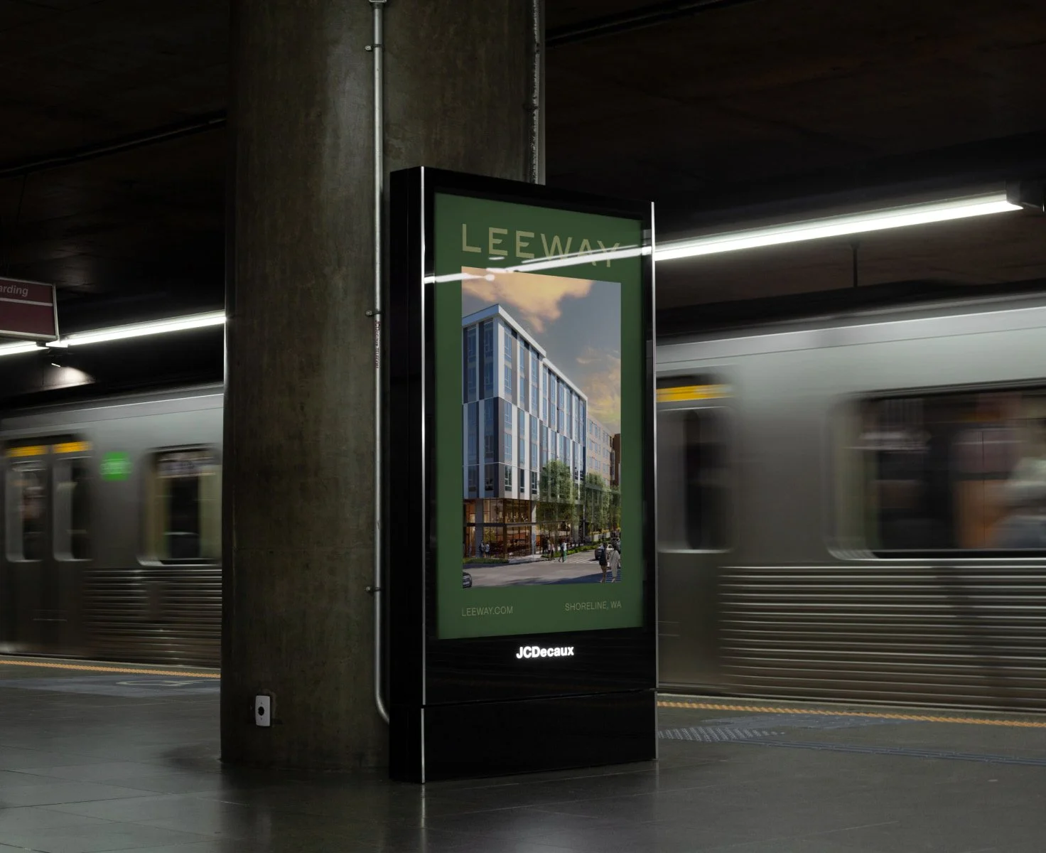

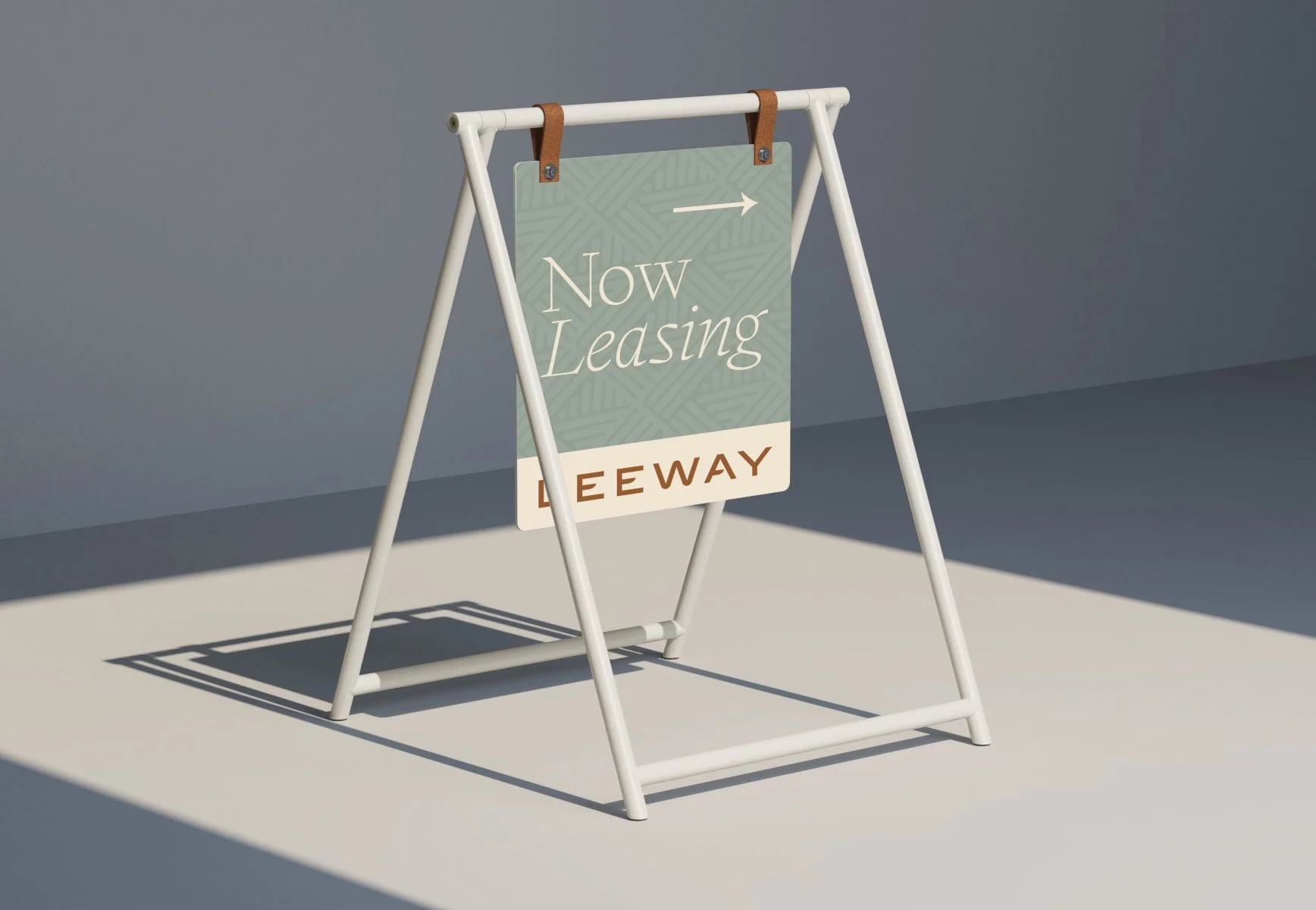
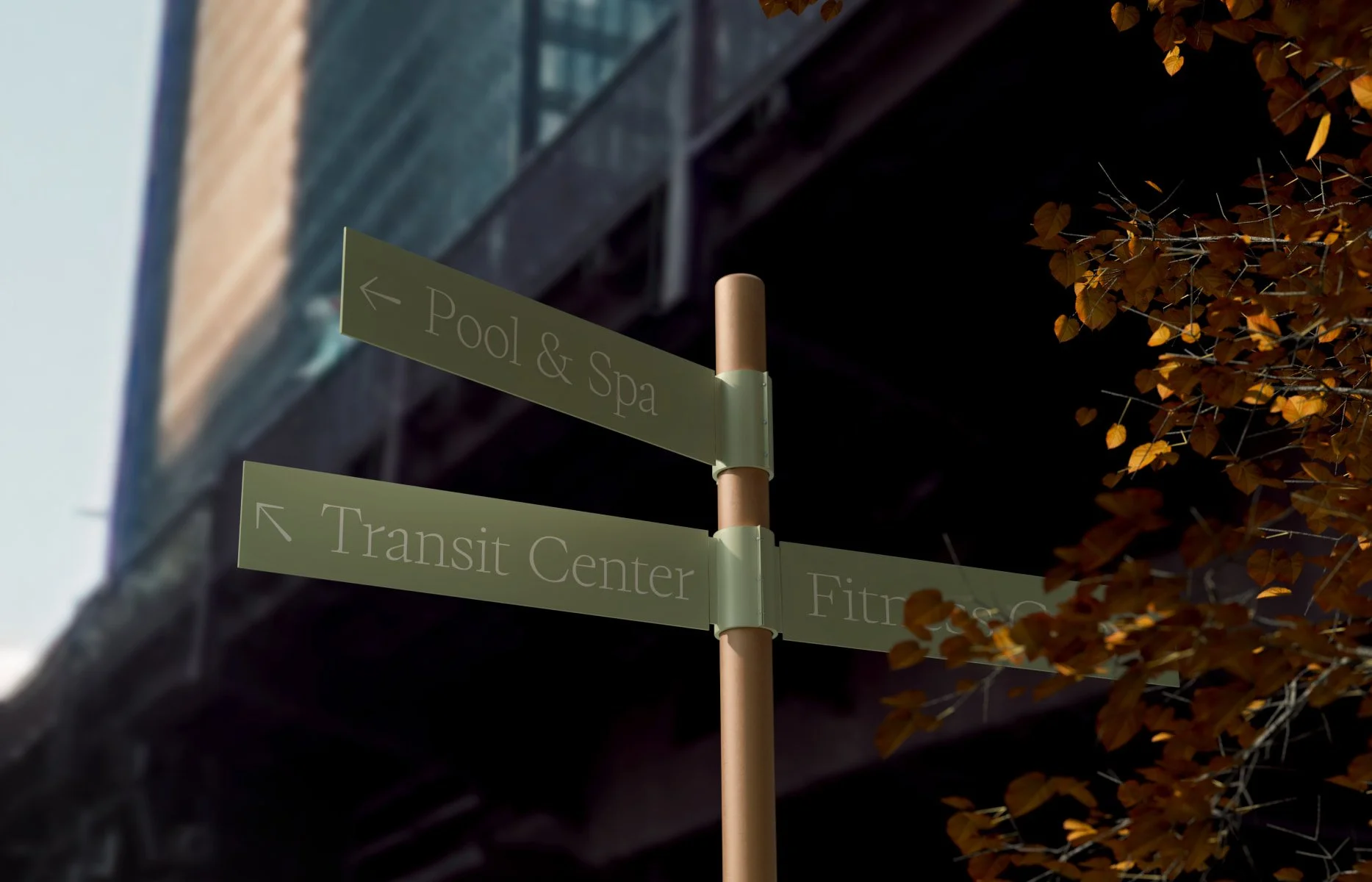
↳ Leeway is not just a logo or a font set; it is a flourishing collection of components that work together in harmony, with each part made stronger by the next.
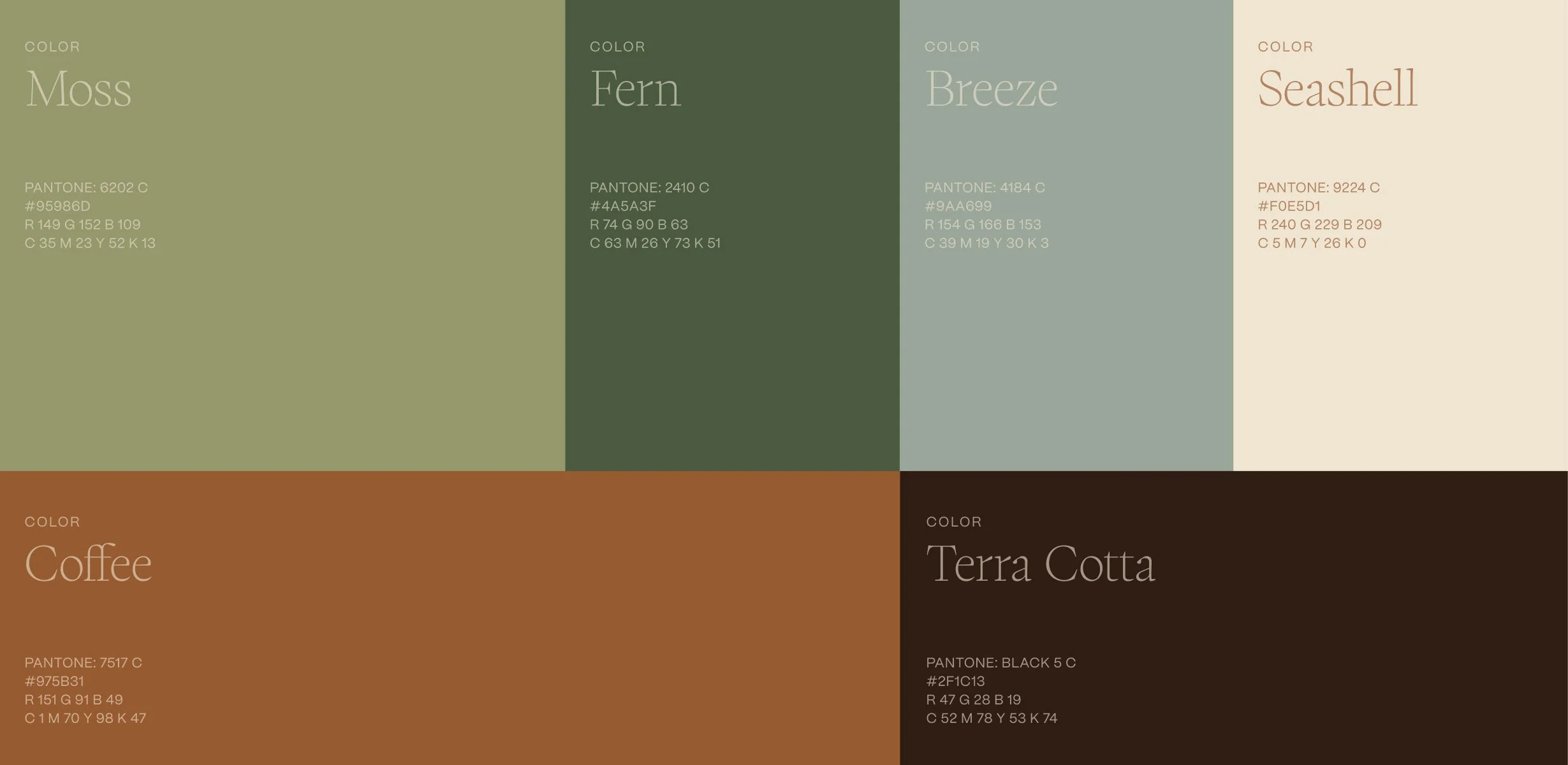
Its palette serves as a connection to both the surrounding landscape and the lush interiors. Its typography is refined to evoke a sense of solace and rest. Nothing stands in isolation—every element is crafted to work in unison.
Unified Elements