Stone Arbor
A HAVEN ON THE FRINGE
At home. At ease. At sea level.
Our buoys for the residential rebrand of Stone Arbor Apartments.
Oceanside is San Diego's last great coastal community... you can't go any further north without leaving. It's not Carlsbad. It's definitely not La Jolla. It's Oside – a county line shared by surfers, marines, and all the in-betweens.
VISUAL IDENTITY
COPYWRITING
BRAND GUIDELINES
MARKETING INTEGRATIONS
We dig beach cities and go way back with this one, so leaning into its authentic, independent spirit was essential for this Stone Arbor overlay.
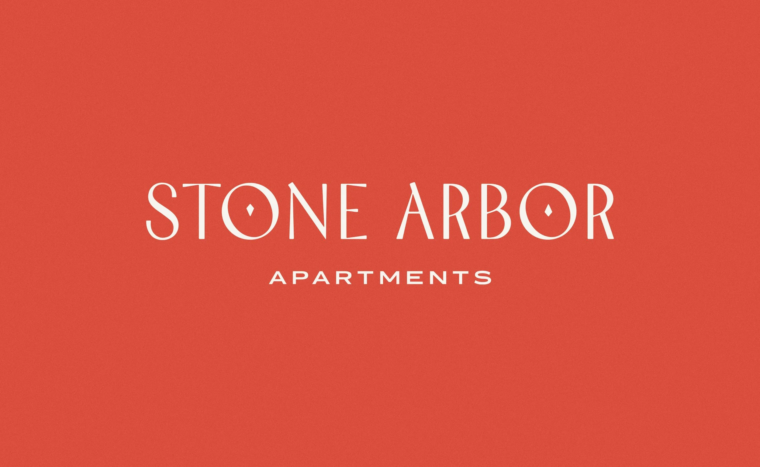
Our client rolled with the right logomark. Coolly upscale with subtle gemstone notches, it feels right at home near the harbor. Here a palm tree, there an arbor, everywhere an ocean breeze.

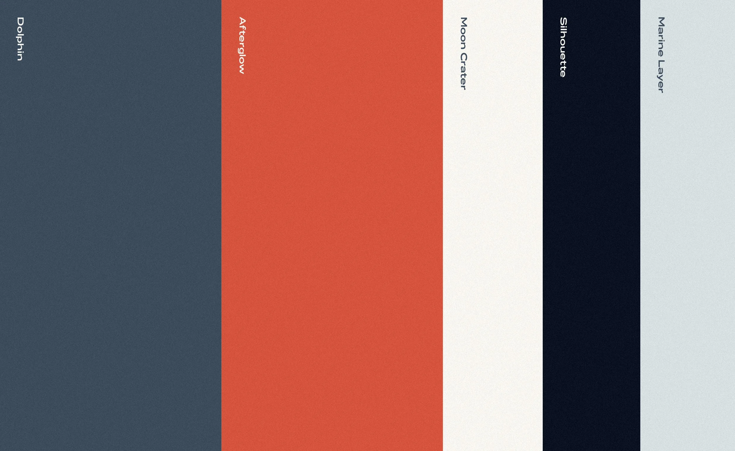

An offbeat red and blue pairing – they go by Dolphin and Afterglow here – salutes Camp Pendleton next door, while typography stretches the day into sundown.